Page 1 of 6
New Hi res Units Progress.
Posted: Thu Aug 21, 2008 5:42 pm
by Fortified Hooligan
Posted: Fri Aug 22, 2008 1:31 am
by The Elfoid
Please shrink that gigantic sig.
Posted: Fri Aug 22, 2008 11:16 am
by vinylrake
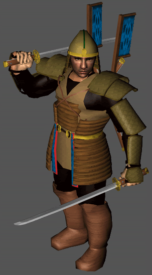
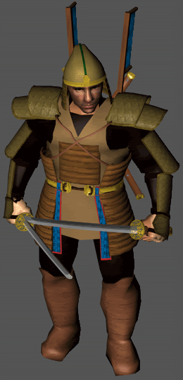
I really like the way the Heron is looking. If it were my birthday, I would wish for some kind of texture or (more) color variation on his tannish (leather?) tunic.
Posted: Fri Aug 22, 2008 12:02 pm
by remedial
These look rad.
Posted: Sat Aug 23, 2008 8:27 pm
by Zeph
looks awesome! can we see some myth size renders??
Oh by theway, stfu Elfoid you arent a moderator here
Posted: Mon Aug 25, 2008 7:03 pm
by Fortified Hooligan
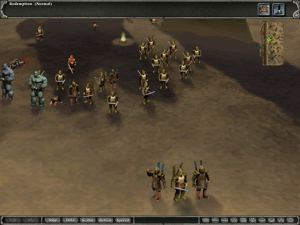
Here is a sample of the heron guard put on screen with other herons.
i didnt take much time to composit the shot or match the lighting, but you can get the idea.
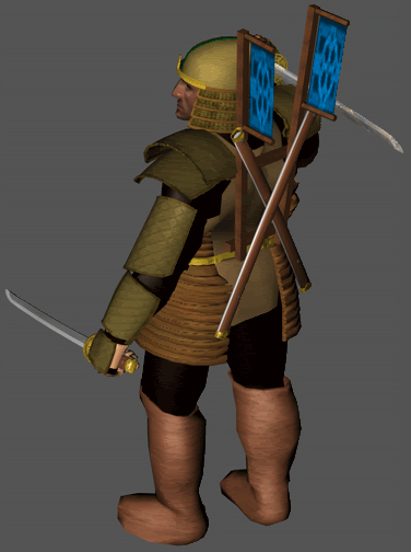
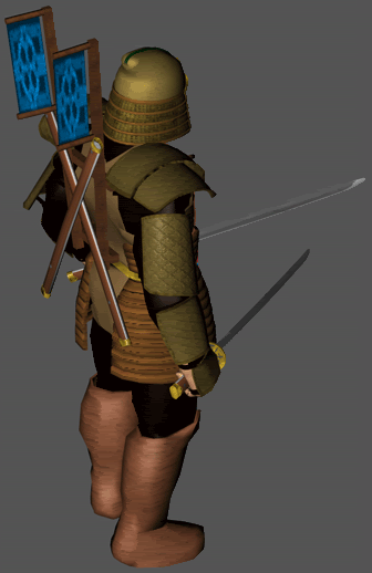
Obviously, mine have the blue banners on their backs.

What do you think so far?
Posted: Mon Aug 25, 2008 7:06 pm
by Buck Mild
Damn.
Posted: Mon Aug 25, 2008 7:11 pm
by Pyro
Ah nice, I laughed when I saw the dead one. I thought "hey that heron is sleeping on the job". Keep up the good work, too bad they won't look like that in the end. They will be a bit blurrier since Myth has its limits. Keep tweaking.
Posted: Mon Aug 25, 2008 7:34 pm
by Fortified Hooligan
For reference, they were rendered at 250X 350 and comped in using Photoshop.
Posted: Mon Aug 25, 2008 9:11 pm
by Myrd
The boots are too pink!

Other than that, great work! Can't wait to see it on maps when you're done tweaking it and making it look even better.
Posted: Mon Aug 25, 2008 9:48 pm
by £N
Amazing.
If I am allowed to critique your work, I would say that the hat should be slightly taller, so the shoulders don't look as hunched, the calfs should be reduced slightly, and the feet should be a little bigger (not wider) and a little more like the exaggerated uggs of the originals, as far as shape and texture. But still, I am impressed. Looking forward to seeing your work in action!
Posted: Mon Aug 25, 2008 9:50 pm
by A-Red
Yeah, those look amazing at Myth size.
A suggestion regarding color permutations: Maybe make the padding (on the stomach and thighs) a primary color, and the flags a secondary color. For the actual armor plates, you could make them color-changable but not affected by team--Iron did that for his hi-res heron, and it really helped ingame, because if you had herons and heron heroes, you could tell them apart from each other by the armor color while still being able to tell what team they're on.
Posted: Sun Aug 31, 2008 7:44 am
by William Wallet
I have to say man, lined up against the Bungie units they look amazing. Can't wait to see what else you come up with; it's been yonks since I was excited about seeing Myth units being modelled (Cydonian and IronDuke set a very high standard - I know there are others, but those two are the ones that stick in my mind).
Posted: Sun Aug 31, 2008 6:24 pm
by vinylrake
now we just need to seem them rendered by the myth engine instead of photoshopped so we can see just how w00teriffic they actually are.
(holding breath anxiously)
:)
Posted: Sun Aug 31, 2008 8:31 pm
by Point
looks great probably a better texture map could be used for the boots other than that looks real good
what are you rendering them in?
