Mariusnet plugin for Myth 3 - room options

Talk about anything here.
Post Reply

Which font looks best for the Myth 3 rooms?

Americratika
9
82%
Hiroshige
1
9%
MVB Sacre Bleu
1
9%
None
0
No votes
 
Total votes: 11

User avatar
Killswitch
Posts: 142
Joined: Tue May 25, 2004 2:04 pm
Location: Los Angeles
Contact:

Mariusnet plugin for Myth 3 - room options

Post by Killswitch »

Note: I made the mistake of posting this right before the message board update so it got lost. Repost.

Hey all,

I've been working on a plugin for Myth 3 that will allow the user to jump onto Mariusnet (without the need to mess the the preference tag). The plug will include new graphics including buttons and room graphics.

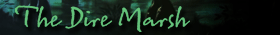
With the option to use Mariusnet poses a problem/opportunity for improvement. The room names used on Mariusnet do not correspond with the current room graphics (go to the room marked 'Blind Steppes' and the Mariusnet message says you are in 'The Dire Marsh'). Also, there are some room names that do not have a graphic available (ie Crow's Bridge, Silvermines, etc).

So with this plugin will come updated room graphics. The question I pose is what font to use. The original Myth 3 font was Americratika. But when Flying Flip updated M3 to work with Play Myth, they changed several of the room graphics to use the font Hiroshige. Either of these fonts is good. There's one more to consider: the font MVB Sacre Bleu which is similar to Americratika but with less flourishes and is a little easier on the eyes.

Some samples to consider:

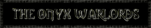
Americratika (original Myth 3 font):
Image
Image

Hiroshige (same as Myth 2 font and Flying Flip updated graphics):
Image
Image

MVB Sacre Bleu:
Image
Image

Of course, if anyone hates all three and has a suggestion for a different font, I'm all ears. Of course, let me know why you don't like these options. :lol:

PS - If anyone is currently working on a Mariusnet plug ofr M3, please let me know. I'd hate to have wasted efforts.
Last edited by Killswitch on Wed Jul 15, 2009 10:00 am, edited 1 time in total.
GodzFire
Posts: 1774
Joined: Wed Nov 02, 2005 8:37 pm

Re: Mariusnet plugin for Myth 3 - room options

Post by GodzFire »

Deja Vu Reply:

Americratika followed by Hiroshige. I've come to appreciate Americratika while working on my M3 Interface.

I'm curious Kills how come you decided to do this?
Graydon
Posts: 1605
Joined: Sun Mar 21, 2004 5:10 pm

Re: Mariusnet plugin for Myth 3 - room options

Post by Graydon »

It'd be great if you could provide godz with the finished graphics FOR his M3 interface...

I'm torn. The represented graphics don't share comparable text heights. Could you possibly re-sample the options but with consistent font vertical height on the graphic background? I'm inclined to think Hiroshige will look better a bit larger. Currently the other two look appealing because they're bigger and easier on the eyes to read maybe due that increased size? Going to hold my vote.
Image
User avatar
Killswitch
Posts: 142
Joined: Tue May 25, 2004 2:04 pm
Location: Los Angeles
Contact:

Re: Mariusnet plugin for Myth 3 - room options

Post by Killswitch »

Graydon wrote:Currently the other two look appealing because they're bigger and easier on the eyes to read maybe due that increased size? Going to hold my vote.
Hiroshige has been updated so the sizes match the other samples.


Poor ol' Graydon's eyes. Crusty little things. : P
adrinux
Posts: 1
Joined: Wed Jul 15, 2009 2:30 pm
Contact:

Re: Mariusnet plugin for Myth 3 - room options

Post by adrinux »

Killswitch wrote:Note: I made the mistake of posting this right before the message board update so it got lost. Repost.
So that explains why not only my reply and vote were lost, but the account I registered too. Doh!

Hiroshige is awful, it's just too clean and computer generated. Graydon is right that it looks better bigger, but it's just not big enough in the M3 interface I think.

MVB Sacre Bleu is nice, warm, friendly, welcoming – in fact too nice. This is Myth.

Americratika is distressed enough to fit with the rest of the interface, the serifs are a bit OTT but it works. It looks worn, aged. It also looks hand written, which sort of fits with the M3 world too.

I did surf around myfonts and came up with Fifteen36 http://new.myfonts.com/search/fifteen36/fonts/ but that looks like old distressed printed writing.

I voted for Americratika :)
Graydon
Posts: 1605
Joined: Sun Mar 21, 2004 5:10 pm

Re: Mariusnet plugin for Myth 3 - room options

Post by Graydon »

Yup, I have to agree here.

Amerikratica gets my vote.
Image
GodzFire
Posts: 1774
Joined: Wed Nov 02, 2005 8:37 pm

Re: Mariusnet plugin for Myth 3 - room options

Post by GodzFire »

Any updates with this Kills? Anything I can help with now that the work on my interface has finished?
Post Reply