Page 9 of 14
Re: myth2 1.8 suggestions
Posted: Fri Jun 17, 2011 8:50 am
by MindBrain
Graydon wrote:I don't care what anyone tells you, taking a resolution that is small, and making it large, does not _add_ any detail to the unit. It makes tiny things bigger. Sure you've increased the resolution, but not the graphical quality.
The only way to add detail with your increased resolution is to render the original 3d model at a higher resolution, so that the actual detail that's present on the model comes through on the new large render.
You might be able to trick your mind into thinking what it's seeing is better looking, perhaps due to increased anti aliasing and blending of colours as they get stretched out to the larger size, but once you see what an actual high resolution render looks like (say anything in The Wind Age plugin), it's hard to go back and say that an upscaled render looks good/really any better than the original bungie size.
Did you even see the plugin I made? The units do look better, the original detail was preserved and the edges look much sharper, just what I was going for.
Re: myth2 1.8 suggestions
Posted: Fri Jun 17, 2011 7:53 pm
by Graydon
You just proved my point.
You managed to preserve what detail was originally there. Not increase it. So ultimately, scaled down with the object tag, there is no extra detail. I'll give you sharper edges, that's true, and if that's what looks good to you, fair enough.
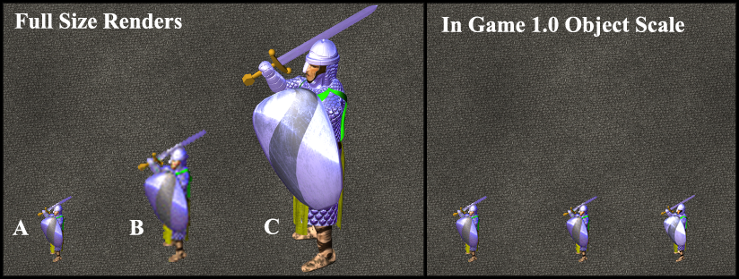
This is my idea of a higher resolution render though, where A is the Bungie Render, B is my mockup of how you've increased resolution in PS from the Bungie version, and C is (obviously) the high res render:

The In Game Scale is a fairly inaccurate mockup, since object scale in game works differently than PS's resizing, and will work even different in 1.8 with a mipmapping system. My point is outlined though, you can only get more details on the sprite if it's rendered bigger.
Re: myth2 1.8 suggestions
Posted: Sat Jun 18, 2011 10:08 am
by MindBrain
Graydon wrote:You just proved my point.
You managed to preserve what detail was originally there. Not increase it. So ultimately, scaled down with the object tag, there is no extra detail. I'll give you sharper edges, that's true, and if that's what looks good to you, fair enough.
This is my idea of a higher resolution render though, where A is the Bungie Render, B is my mockup of how you've increased resolution in PS from the Bungie version, and C is (obviously) the high res render:

The In Game Scale is a fairly inaccurate mockup, since object scale in game works differently than PS's resizing, and will work even different in 1.8 with a mipmapping system. My point is outlined though, you can only get more details on the sprite if it's rendered bigger.
Yea I never was trying to add more detail, just basically eliminate the "JPGness" of the original sprites, and I wanted it done quick. Your B mockup is only resized and nothing more so it doesn't look any sharper. I use a combination of layers with blending, some median filter, and posterizing. Again I was hoping this could get done quick so I can get back to playing Myth (with prettier units)
I just wanted to make the units look better without overdoing it, I don't care if I can see the dirt between the units toes in game....I really hope ya'll aren't gonna overdo it like MythIV demo. The average filesize for my higher res warriors is around 60 - 80k What is it for your warrior? I mean you're talking about mip mapping and 32 bit color, is this gonna make my computer explode? Are some of these thing gonna be optional?
Re: myth2 1.8 suggestions
Posted: Sat Jun 18, 2011 10:36 am
by Pyro
MindBrain wrote:Are some of these thing gonna be optional?
Yes.
Re: myth2 1.8 suggestions
Posted: Sat Jun 18, 2011 4:37 pm
by GodzFire
MindBrain wrote:Yea I never was trying to add more detail, just basically eliminate the "JPGness" of the original sprites, and I wanted it done quick. Your B mockup is only resized and nothing more so it doesn't look any sharper. I use a combination of layers with blending, some median filter, and posterizing. Again I was hoping this could get done quick so I can get back to playing Myth (with prettier units)
But they aren't better at all....just blown up and sharpened to heck, and lost details in the process.
Re: myth2 1.8 suggestions
Posted: Sat Jun 18, 2011 5:50 pm
by MindBrain
GodzFire wrote:MindBrain wrote:Yea I never was trying to add more detail, just basically eliminate the "JPGness" of the original sprites, and I wanted it done quick. Your B mockup is only resized and nothing more so it doesn't look any sharper. I use a combination of layers with blending, some median filter, and posterizing. Again I was hoping this could get done quick so I can get back to playing Myth (with prettier units)
But they aren't better at all....just blown up and sharpened to heck, and lost details in the process.
They're not great but I've seen them in game and they look better then the originals, did you look at the plugin ? I found I need to take out one layer which was increasing the contrast and obscuring just a little detail, but other then that no detail was lost at all....
edit: here's a picture to compare, these units still have the extra contrast though....definitely looks better to me and more so when zoomed out... whatever though I'm just gonna wait for 1.8 .....


Re: myth2 1.8 suggestions
Posted: Sat Jun 18, 2011 6:43 pm
by Graydon
From those two images it appears that with the increased contrast you've totally messed up the colouration for hue changes in the process. Notice how in your top screen every unit looks far oversaturated compared to their original counterparts?
And if anything, the way the new coding is happening, there will be no more overhead running 32bit mipmapped sprites than there would be running normal 8bit indexed sprites, providing you've got your RAM cache set appropriately.
When you say 60-80k, you meant per sprite? My warrior there clocks in at about 120-130kb per 32bit .tif file.
And I'll make it very clear, that image is just a 'mockup' of how it sort of looks. When we're rendering we're rendering 4x the original scale (what I showed above), however when implementing into a 32bit collection we're actually using an algorithm built into oak to rescale units to whatever ratio we want. We've tentatively been testing a size of 2.5x the originals.
Re: myth2 1.8 suggestions
Posted: Sat Jun 18, 2011 8:08 pm
by MindBrain
Graydon wrote:From those two images it appears that with the increased contrast you've totally messed up the colouration for hue changes in the process. Notice how in your top screen every unit looks far oversaturated compared to their original counterparts?
Yes 60 - 80k for each bmp file. The color table is the same as the originals, for each unit the color table was saved, and then before saving the final the original color table gets loaded. Oak won't even let the bmps get replaced if the color table is different. I think the extra contrast just makes it look more saturated. Again I can remove a layer that is making the extra contrast but I'm not gonna bother with it cause like I said I'll just wait for 1.8
Re: myth2 1.8 suggestions
Posted: Sat Jun 18, 2011 9:54 pm
by GodzFire
MindBrain wrote:They're not great but I've seen them in game and they look better then the originals, did you look at the plugin ? I found I need to take out one layer which was increasing the contrast and obscuring just a little detail, but other then that no detail was lost at all....
Yes, I used your tagset, and a lot of details were lost. Everything is just blurred
Re: myth2 1.8 suggestions
Posted: Mon Jun 20, 2011 8:16 pm
by Chilibird
I'm not sure whose end this is on, but I would like to see a 'refuse to be team captain' option for those of us who would prefer not to be. It would prevent people from joining under you, and also prevent you from being a randomly selected captain (unless of course you're on a map with fewer players than spawn points)
Re: myth2 1.8 suggestions
Posted: Mon Jun 20, 2011 9:41 pm
by capital
well suppose everyone had that disable-captain flag set, well then things might blow up... is this what Bungie had intended by taking over the world?
Re: myth2 1.8 suggestions
Posted: Mon Jun 20, 2011 10:58 pm
by punkUser
It has been discussed, and for not letting people join you it makes sense, but it's problematic for random caps... if you don't want random caps, just form a team first

Re: myth2 1.8 suggestions
Posted: Wed Jun 22, 2011 2:54 pm
by BambooStew22
I just submitted the survey for 1.8,.... whom ever oversees such things PLEASE take a look at my suggestions, a few I'm sure youll dig!

Re: myth2 1.8 suggestions
Posted: Wed Jun 22, 2011 8:13 pm
by kingthrall
Bre-unor should receive 1 healing root to make them actually useful in multilayer unit trades.
If possible make a fast way of ctrl 1,2,3 ect group hoykey similar to starctaft instead of holding alt and 1 which is really really slow and annoying.
Re: myth2 1.8 suggestions
Posted: Thu Jun 23, 2011 10:17 pm
by browning
I would like to see the ability to remap group hotkeys implemented in the new patch. Keep the same method for group assignment (hold alt+#), but instead of pressing alt+# to select the desired group, you could simply press the number. This is the system used by other RTS games like Warcraft and I feel it's much quicker to switch between presets. The formations can be remapped to the few first F# keys, which are rarely used.
I also have a few issues with Myth currently. I had to revert back to 1.7.1 because the newest version made my camera movement extremely choppy. Also, when I exit the Myth application, it remains active as a process and consistently crashes my Flash plugin in the browser. I have to manually terminate the process every time to avoid this.

