Page 1 of 2
The new High-Def Myth 2 SB 1.8 Icon
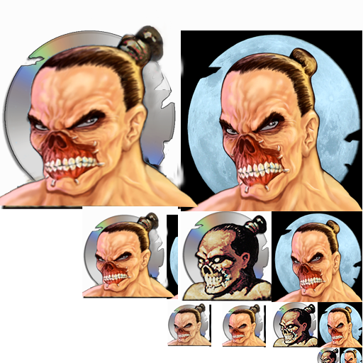
Posted: Tue May 01, 2012 6:59 pm
by GodzFire
Re: The new High-Def Myth 2 SB 1.8 Icon
Posted: Tue May 01, 2012 7:14 pm
by Melekor
"The" new icon? I swear, you do it on purpose...

Presumption aside, that looks amazing. Nice work.

Re: The new High-Def Myth 2 SB 1.8 Icon
Posted: Tue May 01, 2012 7:36 pm
by Jon God
I am still not as much a fan of that art as the original.
Options are awesome though.
Re: The new High-Def Myth 2 SB 1.8 Icon
Posted: Tue May 01, 2012 8:23 pm
by Myrd
But how does it look at smaller sizes? The current one is pretty good in that area.
Re: The new High-Def Myth 2 SB 1.8 Icon
Posted: Tue May 01, 2012 8:26 pm
by Myrd
By the way, it's very close to the 1.4 icon. (attached)
Except for the ponytail cut.
Re: The new High-Def Myth 2 SB 1.8 Icon
Posted: Tue May 01, 2012 9:31 pm
by Pyro
Yeah something about the art makes it less appealing than the one currently being used.
Re: The new High-Def Myth 2 SB 1.8 Icon
Posted: Tue May 01, 2012 11:18 pm
by Point
so does anyone know what happened to Soul blighters nose?
black company faceless man or Limpers description comes to mind though maybe instead of black companies Nail Bitter... in the myth universe there's a Nose Bitter
Re: The new High-Def Myth 2 SB 1.8 Icon
Posted: Wed May 02, 2012 12:40 am
by Point
the new new 1.8 sb icon... or better a new icon.
lol after heated debate on the udogz ... i think your on the right track godz... yes a higher resolution icon is a good thing... though maybe work on the proportions of the head.. and the hair should be more sb like..

Re: The new High-Def Myth 2 SB 1.8 Icon
Posted: Wed May 02, 2012 3:25 am
by zarkwar
Yea squashing it up like that really makes it look more fiendish and less "bro-blighter"
Re: The new High-Def Myth 2 SB 1.8 Icon
Posted: Wed May 02, 2012 5:48 am
by iron
Point wrote:so does anyone know what happened to Soul blighters nose?
Balor kept telling Blighty to stop scratching that pimple or it'd never heal but nooooo ... he just wouldn't listen.
Re: The new High-Def Myth 2 SB 1.8 Icon
Posted: Wed May 02, 2012 9:28 am
by vinylrake
zarkwar wrote:Yea squashing it up like that really makes it look more fiendish and less "bro-blighter"
It's also the proportion of the eyes. Squashing it vertically makes the eyes closer to the original look, but SB's eyes weren't really defined in the original low res version so having them detailed and elongated (like actual human eyes) makes him look less threatening them the undefined glowing monster eyes of the original.
just my 2 cents - i sux at graphics, and overall the new hi-res is very good looking - this is just a trivial thing.
Re: The new High-Def Myth 2 SB 1.8 Icon
Posted: Wed May 02, 2012 5:44 pm
by iron
Actually I think its funny that, without lips, Soulblighter wouldn't be able to say his own name.
Re: The new High-Def Myth 2 SB 1.8 Icon
Posted: Wed May 02, 2012 5:50 pm
by Point
iron wrote:Actually I think its funny that, without lips, Soulblighter wouldn't be able to say his own name.
maybe thats why he is so mean....
the 1.4 icon looks rather good... i think that's closer to what it should be...
Re: The new High-Def Myth 2 SB 1.8 Icon
Posted: Wed May 02, 2012 10:46 pm
by Graydon
When Myrd says Smaller sizes I think he means the 16x16 one, for lists. It's tricky to make it look like what it's supposed to with so few pixels. Curious on that one. I'm still a fan of mine. I have it available at 512, but Myrd didn't want it, so it's 256 only. Something about Vista or 7 not displaying higher than that at the time or something. I still think my version is sharper looking.
Re: The new High-Def Myth 2 SB 1.8 Icon
Posted: Thu May 03, 2012 1:03 am
by Vindicator
all this activity, for this "HD" 1.8 icon, does this mean there is a 1.8 release date in mind?


