Page 1 of 8
Posted: Sun Feb 26, 2006 3:50 pm
by Pyro
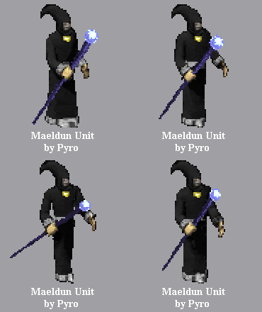
What color would you suggest for Maeldun's cloak. In this image I gave him a dark gray cloak with white for the wrist, waist, and bottom of the cloak. This unit is still not close to being done but I would like to hear any suggestions while it is still a work in progress.

Posted: Sun Feb 26, 2006 4:06 pm
by Zeph
make it pink so we can choose later 
Posted: Sun Feb 26, 2006 4:22 pm
by Lugas
You could make the cloak bit brown like TFL Avataras, but keep the waist, wrists and bottom bit white because I like it that way! 
Posted: Sun Feb 26, 2006 4:25 pm
by Soulytfs_1
Make it Red and blue.
Pyro i know this mb isnt the right way, but will u mb help me with some of my scripting,
ps after u made this units, coz i need it so badly.
Good job so far tgh.
Posted: Sun Feb 26, 2006 4:33 pm
by Pyro
Zeph wrote:make it pink so we can choose later <!--emo&:D
Pink? Ha! It is already that cyan color and green for the wrists, waist, and bottom of the cloak. But what I mean is what color should be the standard... when I add it to my current plugin. Red and blue? Maybe on your plug Souly. :p Red and blue seem too odd in this unit don't you think? As for brown, I thought of that... but was thinking maybe make it look different from the TFL Avatara. I imagine it in some dark color, but I want more sugguests other than pink! 
Souly, what type of scripting are we talking about? Send me a PM or post it here. I'm no pro... but I have learned a lot from the examples I examine. Maybe... I can't promise anything right now... since I'm still working on my Fallen Heroes plugin.
Posted: Sun Feb 26, 2006 5:28 pm
by GodzFire
Pyro here are my comments (please don't take any offense, as you are doing a great job)
- On the top of his cane is a crescent moon, not an orb
- The cane and object color however I think are spot on
- Cut down his shoulder sleeves, they should end at his elbows
- I still strongly feel his cloak is a lighter gray, with the medallion piece he is wearing yellow like you have it. Humor me for once and make his cloak the gray that you have as his end sleeves, and change his face color to match his hands.
Again, no disrespect I think you are doing excellent work. Just humor me and try those changes and post a pic.
Posted: Sun Feb 26, 2006 5:50 pm
by Gleep
It's a freaking robe not a cloak!
Make it light blue with red,gold,or dark blue accents.
Posted: Sun Feb 26, 2006 6:22 pm
by Pyro
Gleep wrote:It's a freaking robe not a cloak!
Make it light blue with red,gold,or dark blue accents.
Yeah its a robe... but I think somebody refered to is as a cloak and I didn't think twice about calling it that. oops :laugh:
Godzfire, don't worry I'm not feeling disrespect. I didn't put the image up to impress but to get more ideas.
For example the face and hands being a bit off in matching color... I missed that. I didn't even notice it. Although I have to go and change all the images I have so far, it will be worth it. The crescent moon instead of the orb... where did you get that idea? I made it an orb cuz thats what I saw on the only image we have of Maeldun.
Now about his shoulder sleeves ending at his elbows... in the image we have of him... it goes to his elbow when his hand is somewhat vertical... look at his other hand... the sleeve ends at his wrist. Or were you just imagining him a bit different. Though I have been thinking of making his robe a bit bigger... not longer but bigger in a few areas like around the wrists. If I can alter the image to your specifications, Godzfire, I'll post the image.... no promises.

Although working on each of these images isn't quite fun... the end product will be fun to use in Fear. Which is what I can't wait for. :laugh:
Posted: Sun Feb 26, 2006 7:14 pm
by Soulytfs_1
Funny thing is im waiting on ur unit, and 2 other people's units so after that ill talk to u about scrip thank u.
Red and blue, mb not, but the idea of longer sleave's is good one try it. \
Were can i get amber?
PC xp
Posted: Sun Feb 26, 2006 7:51 pm
by Pyro
Soulytfs_1 wrote:Funny thing is im waiting on ur unit, and 2 other people's units so after that ill talk to u about scrip thank u.
Red and blue, mb not, but the idea of longer sleave's is good one try it. \
Were can i get amber?
PC xp
Waiting for my unit? Well is your plug a conversion type? Or do you already have all the other parts of your plug ready for the exception of these units you are waiting for?
About Amber for the PC... didn't you already ask that? There isn't any such program... at least not yet. If you didn't know about my unit and the ones you are waiting for, what would you have used?
Posted: Sun Feb 26, 2006 10:46 pm
by Pyro
Okay in this image you see other shades of gray for Maeldun's robe. You will also see a brown one (Lugas suggested), three blue ones (Gleep suggested), a pink one (Zeph suggested, sort of)  , a lighter brown one (Horus suggested.. not quite there though), and the cyan one that I mentioned. Take in mind that since this is a GIF file, it distorted some of the color in a few parts... not major. And I have some attempts at the crescent moon staff Godzfire suggested. I did some slight color change on the face as suggested... except the blue ones and light brown... I forgot them but this way you get an idea of how slight the change is. About the two cyan ones... the left one is the unedited one... how all the images look before the collection ref. changes their colors... and the right one I modified the sleeve to be bigger... it doesn't look as good in this GIF than in the BMP I have it, but you get the idea.
Click here for free Maeldun Samples. 
Posted: Sun Feb 26, 2006 11:08 pm
by GodzFire
Either 2nd or 3rd grey looks best, definitely. Everything just matches well.
Posted: Mon Feb 27, 2006 1:41 am
by Industry
I think Zeph meant the pink that Myth uses as a place holder for TeamColor1 so we can all choose what color we want for Maeldun in multiplayer. Which I would definitely second. Cause the Garnet/Gold I played with in the 90's seems so out of fashion now that I've gone to MidnightBlue/Tan.
After that I like the Horus brown one 6th from the left on the top row, and the strangely the Gleep Blue and Red in the second row. But his description demands some sort of character logical color scheme, and Blue doesn't seem to fit. Although, I guess, he could have a Blood Red robe, stained from years of battle.
Posted: Mon Feb 27, 2006 2:17 am
by floyd
pyro great job, looks real good. thumbs up on taking it far too, everytime i start one of these units i only get about 3 frames done and call it quits. for the staff, i think the orb looks better than the cresent, and less cheesey. as for the robe, he looks a bit short, maybe try adding a few pixels on the bottom of the robe to make him taller, specially becasue his arms are long, but i dunno that might turn out to look bad.
but great job! looking forward for the release! definately inspiring me to make some unites of my own, maybe contribute by making my own avatara.
p.s. nice job on fallen heroes, i enjoyed the beta from your site. have you thought of making a new mesh for it? i think it could be alot more interesting and fun if one was made. maybe even some artifacts for each of the 'heroes'. check out the map i made if u have time. its called 'sons of yu'ron' and its in my uploads folder and it has some artifacts that might give you some ideas on what im talking about. but anyways great work and hope to see something come out of it soon!


