The new High-Def Myth 2 SB 1.8 Icon
Re: The new High-Def Myth 2 SB 1.8 Icon
When it is ready. There is no specific date at this moment.
-
Eddaweaver
- Posts: 1026
- Joined: Mon Sep 13, 2004 6:05 am
- Location: M.E.
Re: The new High-Def Myth 2 SB 1.8 Icon

David Bowie, Michael Jackson and Gene Simmons rolled into one bad boy ronin
Re: The new High-Def Myth 2 SB 1.8 Icon
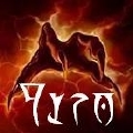
The shape of the head is definitely different than the original icon, for good or for bad. I also agree with the observation that the eyes look a fair bit different - more "angry" than creepy/evil/happy in the original; again not good or bad, just different. In terms of criticism though I'd say the shading on the ponytail is a bit off relative to the rest of the hair... it makes it look as if the ponytail is wrapped more towards the camera than coming out of the back of his head as one would expect.
Regarding icon size, I think you'd be pretty hard-pressed to argue that anything over 256^2 really is worth the bloat in the patch/EXE sizes. Even the 256^2 icon was largely responsible for the increase in size of 1.7.2, and 512^2 is another chunk on top of that.
So while I agree that it's worthwhile to have done the shift to a modern, alpha-blended icon with a few sizes larger than the original (if only to handle forthcoming high-dpi screens better), there are massively diminishing returns. At 512^2 it's really a picture, not an "icon". I think it's waaaaaaaaaaay more important to concentrate on making sure that the small versions look good than adding larger sizes. Large is easy, small is hard

Re: The new High-Def Myth 2 SB 1.8 Icon
Punk: Agreed, anything above 256 is overkill and will just bloat the exe. The current one is farily blurry at 256 and even 128 though, so I do think it should be replaced if we can get a better version. (Kudos to Gray for making them look as good as they do, but there's only so much you can do when upscaling a tiny image).
Godz: Can you upload the PSD with layers intact so it can be tweaked?
Godz: Can you upload the PSD with layers intact so it can be tweaked?
Re: The new High-Def Myth 2 SB 1.8 Icon
Greatness, in a zip file
http://www.mediafire.com/?wu0kc28pf3to8tc
http://www.mediafire.com/?wu0kc28pf3to8tc
-
Eddaweaver
- Posts: 1026
- Joined: Mon Sep 13, 2004 6:05 am
- Location: M.E.
Re: The new High-Def Myth 2 SB 1.8 Icon
I had written out a post and then the comp crashes...
One thing I was going to say is that despite the nature of the Myth II storyline I think this new icon is too overtly gruesome and confronting. Bungie's SB was less fleshy and alive, more dried, deathly, mediaeval, skeletal, undead, ancient, shrunken, worn and balding. In the scene SB was confronting a berserk instead of the observer.

One thing I was going to say is that despite the nature of the Myth II storyline I think this new icon is too overtly gruesome and confronting. Bungie's SB was less fleshy and alive, more dried, deathly, mediaeval, skeletal, undead, ancient, shrunken, worn and balding. In the scene SB was confronting a berserk instead of the observer.
Re: The new High-Def Myth 2 SB 1.8 Icon
.....................uh what

Re: The new High-Def Myth 2 SB 1.8 Icon
The Soulblighter on the box did look a little bit mummified. But the Soulblighter in the cutscenes wasn't so much. Personally I like the box look better.
The cake is a lie.
-
Eddaweaver
- Posts: 1026
- Joined: Mon Sep 13, 2004 6:05 am
- Location: M.E.
Re: The new High-Def Myth 2 SB 1.8 Icon
Mummified, that is the word.
The cutscenes in Myth II were outsourced to Anime International Co, so they may look a little Japanese.
The cutscenes in Myth II were outsourced to Anime International Co, so they may look a little Japanese.